Saturday, April 2, 2016

4/2

1.    What was it like using your hand as subject matter for a drawing?

I found it incredibly difficult to use an object that isn’t stationary as a subject. I found that the positioning of my hand kept changing, and also, that the shading kept changing, if I moved my hand at different angles. I think drawing or painting a living object for the subject requires much more experience in shading concepts.

2.    What media did you select - pencil or charcoal? Why?

I chose to use charcoal as a media, because I wanted it to be permanent. I find charcoal is much harder to erase; therefore, making it much more honest and definite. That being said, if I were to recreate this drawing, then I would use pencil first, then apply charcoal to create more contrast.

3.    How did it feel to create a drawing with your non-dominant hand?

I had a difficult time using my non-dominant hand to draw. I found that the intricacies in drawing abilities were non-existent. Tasks such as  shading, and outlining became very difficult. I was expecting my experience in drawing to transfer; regardless of what hand I used, but I was wrong.

4.    Compare and contrast your final drawings. Do you think they are successful studies?

The right hand feels more controlled. The outline is more accurate, and the shading is more uniform; however, the left hand is much shakier and less accurate in scale. I find the contrast in shading the left hand is much more inconsistent, where the right hand is more defined.

5.    Would you consider using your non-dominant hand to create artwork in the future?

I enjoyed using my right hand to draw. It almost gives everything a Basquiat feel. I would consider using my hand again. In music, I often play instruments differently to find different tones and structures, and I think the same applies in art. Also, it was enjoyable to be challenged in such a simple task.


Saturday, March 19, 2016

Chapter 14-15 questions

1.    Explain why you selected the video you choose from the selection listed above.
The reason I chose “The Greek Awakening: Art from the 5th Century BC” was because the title insinuates a transition in Greek culture.  While the other titles do describe parts of Greek culture, the word “ awakening” made me think of Buddhism and so I decided to watch that specific video.
2.    For each video list/discuss the key concepts you learned.
In the Awakening video, I learned that around the 5th century B.C. that greeks shifted their focus from Gods being the center of the universe, to the individual. Around this time, Greeks started positing questions about purpose, existence, mathematics, and other areas of philosophy. Also, I learned about the different uses for the Parthenon, for example: It was used as a mosque, and a temple, before scholars would congregate.
In “More Human than Human” I learned about different cultures and their and values: pertaining to the representation of human figures in art. Also, I learned about the seagull research done at Oxford: which is theorized to describe why historic cultures accentuated certain salient features of the human body in art.
3.    How do the videos relate to the readings in the text? The videos relate to the text, because they all describe the relationship between culture, art, and architecture.  There is a correlation between the ways in which Egyptians and Greeks valued mathematics; resulting in art and architecture that placed a heavy emphasis on mathematics. The prehistoric figure, found in Vienna also is representative of these correlations. as heavier women were more capable of successfully carrying children in those times, the idea of female beauty conveyed in art, indicates that certain salient features were sought after to ensure the existence of their tribes.

4.    What is your opinion of the films? How do they add depth to understanding of the readings and art concepts?
I really enjoyed both films, because they illustrated how our perceptions of beauty are influenced by culture, but also, how both of those factors influence art and architecture. The films also depicted how Greeks used mathematics to compensate for visual effect using a slight bulge “entasis”.  I also learned about how Christians and Greeks used architecture to bring people together. In Christianity, multi-purpose halls “Basilica’s” were designed for congregational worship. In Greece, The Parthenon was used a place of central worship, but also, for scholars to philosophize.  


Saturday, March 12, 2016

Module 7

1. In “Last Call for Planet Earth,” I learned about different concepts in sustainability: which are focused on designing and constructing infrastructure in a way that promotes and utilizes sustainable environmental resources and conditions. These methods can be used for heating, cooling, and lighting.
In “Frank Gehry: Architecture as Art” I learned about designing for aesthetics; instead, of for sustainability. Architect, Frank Gehry has been an influential figure in contemporary architecture. His designs focus on utilizing multiple materials that redefine how we think about modern architecture: advances in computer drafting have allowed for Gehry to focus more on developing compelling structures.
2.    Both of the videos that I watched challenge many of the basic assumptions and ideas we have about traditional architecture. Both videos also illustrate how divergent ideas can solve many of the problems we face with energy, and our climate. The textbook addresses much of the history in architecture, but also, it focuses on the future of architecture, including: new materials, and technologies.  
3.    I really enjoyed both of the films. “Last Call for Planet Earth” illustrated the different concepts and materials that can address issues of sustainability and enrgy consumption: while, “Frank Gehry’s” documentary discussed the influence of art and technology in architecture. Both of these films exemplified how technology and art can assist in developing and modifying structures that will help reduce our consumption of natural materials and other resources.

4.    I chose to watch both videos, because I am passionate about environmentalism and art. I found both videos to be very informative and intriguing, and am interested in learning more about technological advances in architecture; pertaining to sustainability.

Saturday, March 5, 2016

Reviewing Peer Responses

1.
2. When looking at project #1, I did notice multiple elements and priniciples; however, I think it would have to be completely intentional for a photographer to limit the amounts of these elements.
3.None of the artists that I chose were in my peers collection, but this was done intentionally. I wanted to see why different art attracted my peers attention, and through that, I developed a better understanding of the individual.
4. Charles E Burchfield “Winter, East Liverpool 1927,” Oil on Canvas, really peaked my interest, but in an indifferent way. The art itself seems to be a caricature, and almost a cartoonish representation of that time and place: which leaves to question, what is the distinction between fine art and television? I’m not sure if I love this piece or not, but I keep finding myself staring it at.
5. What I found to be really fascinating in reviewing both projects by two individuals was the level of knowledge I have acquired about both of my peers. Ashley’s art: in both projects, contained some form of nature in it. Abstract Muse’s art: was almost always abstract, and these qualities permeated through her photography. It’s really interesting to see what motivates and inspires others artists to create.

6. I found both comments to be very insightful: as they supported and critiqued my style. I think constructive critism is imperative: as long as it doesn’t render one useless. Gaining the perceptions of others has helped me identify my strengths and weaknesses.

Module 6

1.    For each video list/discuss the key concepts you learned.
In the sculpting video, I learned how sculptors create molds, by using metal, silicone, and platers. First, sculptors place metal seams into the artwork: to divide the silicone mold into as many parts as needed. Next, the artist covers the clay figure in silicone to protect it from damage: when creating a negative print. Last, the artist covers the silicone in plaster, and when its dried the artist drills holes into the cast, which will then be screwed together, when casting the plaster.
          In the Glass and Ceramics video, I learned the different methods and techniques artists use to shape glass. Using Silica Sand and various fluxes, such as: Limestone, Pot Ash, or Oyster Shells, the glass maker heats these components. Once properly heated, the glass maker gathers a lump of the molten glass on their rod. Next, the maker inflates the molten glass, by blowing into the rod: which will then be shaped, using various tools of wood, steel, or wet newspapers. When completed, the maker will reheat the formation, to make it more structurally reliable.
2.    How do the videos relate to the readings in the text?
 One recurring theme between many of the materials described in Chapter 11-12 and the videos are the unique characteristics with each medium. There is an emphasis placed on each material, how it relates to the earth, and the imperfections with each medium. It is then the artist’s job to exploit the imperfections within that medium to enhance their vision.

3.    What is your opinion of the films? How do they add depth to understanding of the topics: Sculpture, Installation, and Craft?

I really enjoyed both of the films, and I found them to be very informative. The Sculpting video demonstrated how laborious sculpting in stone can be: it is a very meticulous form, which requires lots of patience, and effort.  Regarding installation: the use of glass in architecture demonstrates its ability to form and shape our perceptions of our environment: acoustically, aesthetically, and thermally. The videos also exemplified each person’s skill and their artist relevance: watching how sculptor’s create their work, demonstrated the amount of diligence, labor, and patience required to perfect their style within that medium: described in the textbook as their “craft.” 

Sunday, February 28, 2016

Logo

1.    Discuss what you thought about creating your logo.
I really enjoyed creating my logo: it allowed me to focus on the important objects within my life, and use those objects in trying to describe myself. I knew from the beginning that my design would involve musical instruments, but I wasn’t quite sure how I was going to utilize them.
2.    Describe the process: creative thinking skills and ideas you used in the logo creation.
I started my logo design with the idea that I would use a guitar and microphone crossing: to ensure that the logo would be balanced; however, I knew that I wanted to include more elements, but I wasn’t positive on how. In my second design I decided to maybe place a music staff wrapping around these two objects, but I felt it was redundant. When I realized that I should use the staff as a banner for my initials, the rest just fell into place. I placed a flaming heart behind these two objects, and felt that the logo was sufficiently balanced.
3.    What was the most important discovery you made in the creation of your logo?
The most important discovery I made in creating my logo was the interaction between different utensils. I originally designed the complete logo in charcoal pencils, but decided to use sharpies to accentuate certain objects, but also, to add more contrast. The use of sharpie over the heart was very subtle, due to the consistency of the charcoal underneath it,, but where the charcoal was used at a minimum(side of guitar), it allowed me to shade with more precision, and less bleed.
4.    What is the most important information you learned from watching the videos, powerpoint, and reading material  for this project? What is your opinion of the videos?

I found the information in the research material to be very helpful in designing my logo. The most important things I learned through the material was the importance of picking a logo that translates well across several mediums, and is scalable. Also, it is important to know your demographic, and whether the product logo will translate well across cultural lines.  In the Marmite video: as well as the Graphic Design video, I learned a lot and found the informational to be relevant and playful: I really enjoyed both of them.


Questions

Janet Fish (A
  A.    The Oil on Canvas scenery in Gustave Courbet’s “ La Source la Loue” intrigued me: To me, it illustrates the allure of the unknown. The ripples in the water make the viewer question, what is on the other side of this painting?  As the water appears to be flowing away from the darkness. Also, what is the light source illuminating the walls? The ominous entry into the cave leaves me asking many questions, as to whether the artist is trying to convey the power of the unknown, or something else. Erin Shirreff’s “drop ( no 14)” was the second thing that really intrigued me. This piece truly demonstrated the how versatile and nuianced different types of steel could appear. Using hot-rolled, cold-rolled and Cor-ten Steel, Shirreff contrasts these subtle differences through color and placement. The largest piece of steel on the right appears to have been cold and hot rolled in different sections: which changes the color and reflective quality. In addition, each piece of steel appears to have small striations from the rolling process: which feels purposefully arranged, so that the pieces can further contrast which each other. The reason this piece intrigues me is because it demonstrates the versatility, and nuisances of the medium: it feels very architectural and intentional in the way everything is arranged.

.     B.  To me, the two pieces that I felt a connection with both had one thing in common: music. Georges Braque, “Still Life on a Mantelpiece” demonstrates the relationship between music and life.  Braque achieves this by blurring the lines between the objects and background.  The music sheets in this painting, transform into the background; and the guitar neck breaks into obscure shapes, and is outlined with the same textured black as the background. Braque creates so many layers, that is becomes harder to discern what is the object, and what is the background. I believe this resonates with me, because it demonstrates how engrained music is in society.  My favorite piece of work, at the Albright-Knox was William Harnett;s “Music and Literature.” In my opinion, this Oil on Canvas piece demonstrates the frustration of writing music. The first thing I noticed was how the books were book-marked and carelessly piled: as though the subject who placed them was scattering to find something of meaning within the books. Harnett also conveys that the subject spent much time at this desk, because the candle has burned down to the bottom. The other thing that I noticed was the condition of the music sheet: it appears as if the writer has been fighting with this specific piece. All the other sheets are properly rolled, but one sheet  appears to be tattered, torn, folded, and stained: This illustrates that the subject has had a particular hard time with this sheet.

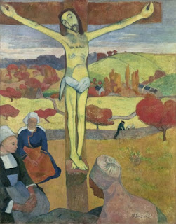
C.      Upon viewing Paul Gaugin’s “Le Christ jaune,” I became very curious about this oil on canvas painting. The scenery depicted in this painting leaves me questioning the artists intention. Was it to demonstrate this prominence of Christianity in Europe? Also, what is the significance of these colors typical to Fall? While I appreciated the color profile of this painting, I just don’t understand the significance of it.  The oil on canvas painting, by Janet Fish, “After Leslie Left,” also left me puzzled to the intention of this piece. The title insinuates that maybe a woman or cleaner had left, and this is the only trace of her existence left, but is the artist trying to convey her sadness for the things Leslie represented, or is she stating something else? Also, what significance does the bowl hold? It’s obvious that Leslie performed the roles of a wife/lover, or cleaner, but the presence of the bowl with bananas is maybe a reference to something that only the artist can divulge. 


, born 1938). After Leslie Left, 1983–84. Oil on canvas